


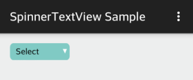
Spinner-like TextView: A Dialog Spinner that displays default “Select” text
Problem – Setting default text to a Spinner
Spinner out of the box does not allow you to set a value that displays by default and not appear in the list of options.
Approach – Custom view
We can imitate the behavior of Spinner with the following ideas:
- Have a TextView that visually looks like a Spinner
- Display a default text(e.g. “Select”) at first initialization.
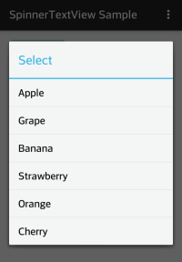
- When it is pressed, display a AlertDialog.
- When an option is selected, update the text on the TextView.
This will earn us the flexibility to display a default text. However, there are a couple drawbacks. First, unlike Spinner, it does not save view state on its own. Therefore, we are responsible for saving and restoring the selection. Second, we have to take extra effort to apply style to make it look like Spinner.
Solution
SpinnerTextView.java
1 2 3 4 5 6 7 8 9 10 11 12 13 14 15 16 17 18 19 20 21 22 23 24 25 26 27 28 29 30 31 32 33 34 35 36 37 38 39 40 41 42 43 44 45 46 47 48 49 50 51 52 53 54 55 56 57 58 59 60 61 62 63 64 65 66 67 68 69 70 71 72 73 74 75 76 77 78 79 80 81 82 83 84 85 86 87 88 89 90 91 92 | /** * Created by Miga. * Dialog Spinner-like TextView. * Imitate Dialog Spinner by extending TextView. * A workaround to have a Spinner that you can set a default text that is not part of options. */ public class SpinnerTextView extends TextView implements View.OnClickListener { private String mPrompt; private CharSequence[] mEntries; private int mSelection; private OnItemSelectedListener mListener; public interface OnItemSelectedListener { void onItemSelected(int position); } public SpinnerTextView(Context context) { super(context); init(null); } public SpinnerTextView(Context context, AttributeSet attrs) { super(context, attrs); init(attrs); } public SpinnerTextView(Context context, AttributeSet attrs, int defStyle) { super(context, attrs, defStyle); init(attrs); } private void init(AttributeSet attrs) { if (attrs != null) { TypedArray typedArray = getContext().obtainStyledAttributes(attrs, R.styleable.SpinnerTextView); mPrompt = typedArray.getString(R.styleable.SpinnerTextView_android_prompt); mEntries = typedArray.getTextArray(R.styleable.SpinnerTextView_android_entries); typedArray.recycle(); } mSelection = -1; mPrompt = (mPrompt == null)? "" : mPrompt; setText(mPrompt); setOnClickListener(this); } public String getSelectedItem() { if (mSelection < 0 || mSelection >= mEntries.length) { return null; } else { return mEntries[mSelection].toString(); } } public int getSelectedItemPosition() { return mSelection; } public void setSelection(int selection) { mSelection = selection; if (selection < 0) { setText(mPrompt); } else if (selection < mEntries.length) { setText(mEntries[mSelection]); } } public void setListener(OnItemSelectedListener listener) { mListener = listener; } @Override public void onClick(View v) { new AlertDialog.Builder(getContext()) .setTitle(mPrompt) .setItems(mEntries, new DialogInterface.OnClickListener() { @Override public void onClick(DialogInterface dialog, int which) { mSelection = which; setText(mEntries[mSelection]); if (mListener != null) { mListener.onItemSelected(which); } } }) .create().show(); } } |
This is straightforward. The main points are to create an AlertDialog in OnClick() and to implement the core methods you would use in Spinner such as getSelectedItem() and the like. You can define more methods for your needs.
res/values/attrs.xml
1 2 3 4 5 6 7 | <?xml version="1.0" encoding="utf-8"?> <resources> <declare-styleable name="SpinnerTextView"> <attr name="android:prompt" /> <attr name="android:entries" /> </declare-styleable> </resources> |
In this example, we will define the default text(prompt) and the entries in xml.
res/values/arrays.xml
1 2 3 4 5 6 7 8 9 10 11 | <?xml version="1.0" encoding="utf-8"?> <resources> <string-array name="fruits" > <item>Apple</item> <item>Grape</item> <item>Banana</item> <item>Strawberry</item> <item>Orange</item> <item>Cherry</item> </string-array> </resources> |
res/drawable/state_spinnertextview.xml
1 2 3 4 5 6 7 8 9 | <?xml version="1.0" encoding="utf-8"?> <selector xmlns:android="http://schemas.android.com/apk/res/android"> <item android:state_pressed="true" android:drawable="@drawable/spinner_bg_pressed" /> <item android:drawable="@drawable/spinner_bg" /> </selector> |
You can define state list drawable to accommodate states such as enabled/disabled, pressed, and so on.
res/layout/activity_main.xml
1 2 3 4 5 6 7 8 9 10 11 12 13 14 | ... <com.migapro.spinnertextview.SpinnerTextView android:id="@+id/spinnertextview" android:layout_width="@dimen/spinnertextview_width" android:layout_height="wrap_content" android:paddingRight="@dimen/padding_right" android:paddingLeft="@dimen/padding_left" android:paddingTop="@dimen/padding_top" android:paddingBottom="@dimen/padding_bottom" android:background="@drawable/spinnertextview" android:textColor="@color/black" android:prompt="@string/spinner_prompt" android:entries="@array/fruits"/> ... |
Set padding, drawable, and anything else to make it look like Spinner.
You can make use of setOnItemSelectedListener(OnItemSelectedListener listener) to catch the event in callback.